
Looking at your restaurant data should be an easy, quick process and you shouldn’t need a degree in statistics to do it. Imagine being able to glance at a colorful, intuitive dashboard and instantly grasp key insights about your restaurant’s performance – from customer preferences and dining trends to inventory management and revenue streams. Regardless of what platform you’re using, data visualization takes the thousands of numbers and metrics you’re gathering every day through software, and makes it both visually appealing and digestible, empowering your managers to take proactive steps towards success.
In this article, we’ll explore the various aspects of data visualization specifically tailored to the unique needs of the restaurant industry. We’ll unveil the benefits of visually representing data, such as spotting inefficiencies, identifying growth opportunities, and enhancing the overall customer experience.
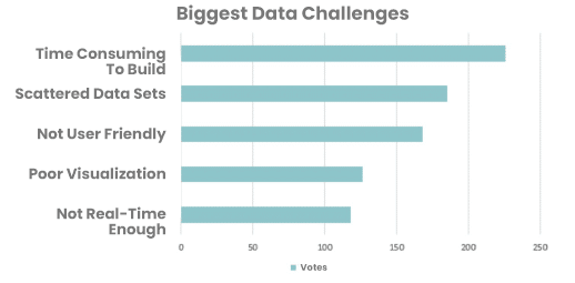
There are a number of challenges operators face when visualizing the vast amount of data they collect through different software. According to a survey by Restaurant365 of 355 customers running 5,500 locations, here are the top challenges:
Choosing the right type of data visualization or graph depends on the nature of the data you want to present and the message you want to convey. Restaurant operators typically use three different types of visualization. Here’s a brief overview of when to use them:
Bar Charts
Ideal for comparing categories or displaying discrete data. Use them to show comparisons, rankings, or changes over time. They are straightforward and effective in presenting categorical data.
Bar charts are best used to look at daily and weekly sales and their fluctuation, sales of different menu items, and more. Bar charts are also useful for analyzing customer feedback ratings and their components, like service, food quality, and ambiance.
Line Charts
Great for showing trends and changes over time. Use them to visualize continuous data and identify patterns, fluctuations, or growth over a specific period.
Line charts can be used to track restaurant revenue, CoGS, and prime cost over longer time periods to see trends. Use a line chart to illustrate the trend in revenue over a monthly, quarterly, or even year-long timeline. This can highlight seasonal patterns or overall growth/decline.
Pie Charts
Perfect for illustrating proportions or percentages of a whole. Use them to showcase the composition of a category or compare different parts within a whole.
Pie charts can be used to view metrics like composition of menu items and sales of menu items. Using a pie chart shows the distribution as part of a whole, and makes it easy to analyze the performance and popularity of your entire menu.
Real-world Restaurant Data
Let’s take a look at some sample restaurant data from Restaurant365 to see some real-world examples.
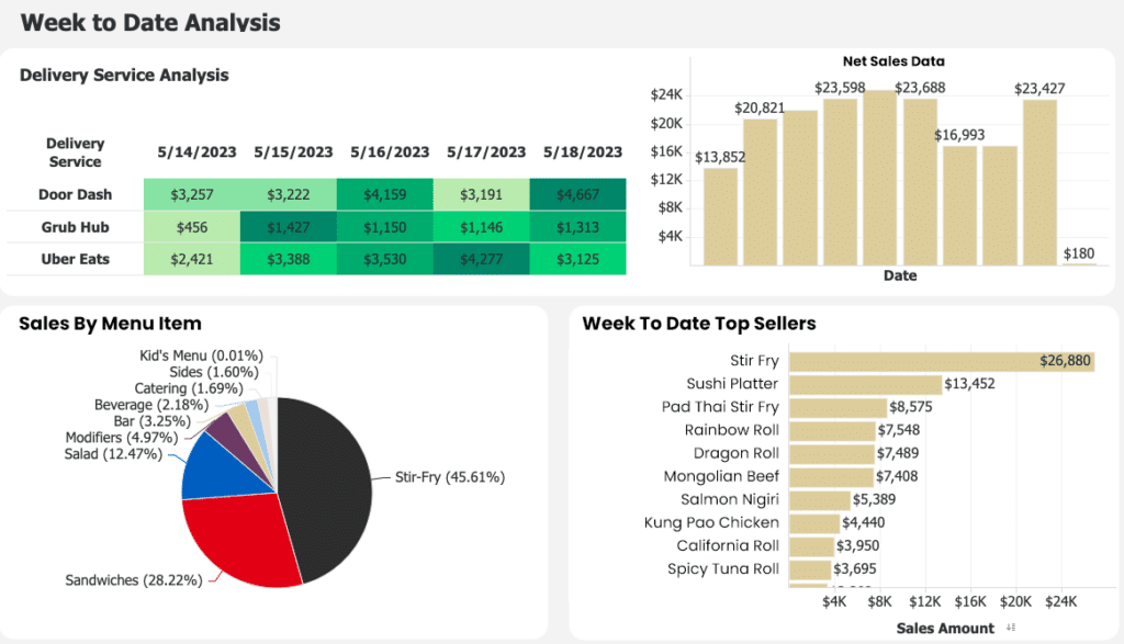
Here we can see a restaurant’s week in a Restaurant365 dashboard. We can see delivery service analysis, net sales, sales by menu item, and weekly top sellers.
Net Sales Data: This data is displayed in a horizontal bar chart, making it easy to see sales across the week. For an average week, we can expect some fluctuation between weekdays and weekends, open hours, and any events or specials that might attract customers. The same data can be shown weekly, monthly, or quarterly which removes this variability to see longer sales trends.
Week To Date Top Sellers: This data is represented in a vertical bar chart, but it could be represented in a pie chart as well. The benefit is the ability to see how menu items rank against each other, and gain insights on customer preferences. Operators can then make adjustments through menu engineering to highlight top-sellers or remove items that underperform, depending on where they rank in profitability.
Sales By Menu Item: This data is seen in a pie chart, making it easy to see how different menu categories perform. Operators can categorize different menu items to see their performance in groups, making it easier to analyze. As with weekly top sellers, this allows operators to make adjustments through menu engineering.
Delivery Service Analysis: This data isn’t represented in one of the three charts, but in an Excel spreadsheet format. It makes use of cell color in order to highlight which delivery service is bringing in the most revenue.
Wrapping It Up
Data visualization provides a powerful tool for easily and quickly analyzing restaurant data without any training. By utilizing colorful and intuitive dashboards, restaurant owners can gain instant insights into key performance indicators, including customer preferences, dining trends, inventory management, and revenue streams. Regardless of the platform used, data visualization transforms overwhelming numbers and metrics into visually appealing and easily understandable representations, empowering managers to be proactive in not just tracking data, but using that data to make changes to make improvements to their restaurant.